For the past few months, I’ve been hard at work on my upcoming third course, Whimsical Animations.
For each course, I create a custom landing page, and for a course about I knew the landing page needed to be very extra. It took longer than I’d care to admit, but the course’s landing page(opens in new tab) is now live. 😄

At first glance, it looks pretty straightforward, even minimal… but there’s a lot going on under the surface. This landing page contains 14,000+ lines of code and 200+ files!
In today’s blog post, I want to dig into some of the more interesting details and share how I built them. It won’t be a full-blown tutorial, but my goal is to give you a few solid techniques you can start using right away in your own work. ✨
Link to this headingSome quick context
If you’re familiar with my work, you know I love including whimsical lil’ details. Every week, I get questions around how I built a particular animation or interaction.
Whimsical Animations is my attempt to bottle up all of that knowledge and experience into a comprehensive interactive online course. You’ll learn the set of core techniques I use to design and create all sorts of different effects.
It covers some of the most popular animations and interactions from this blog and my other projects, but my goal is much more broad than that. I want to give you the tools you can use to come up with your own unique effects.
You’ll learn how to build animations and interactions using vanilla web technologies: CSS, JavaScript, SVG, and 2D Canvas. There will also be some extra content focused on React integration (which should translate reasonably well to other JS frameworks). The bulk of the course focuses on implementation, but we’ll cover the design process as well.
After more than 18 months of work, registration is finally open! You can learn more and sign up here:
Link to this headingChaos toolbar
The main thing that makes this page interesting is the “Chaos Toolbar”, a set of buttons in the top-right that allow the user to manipulate the page.
For example, the grabber tool lets you pluck and throw individual elements:
There’s also the bomb tool, which does exactly what you’d expect:
Each tool has an icon, and each icon has unique animations. Let’s enlarge these icons so that we can examine these animations more closely. Hover or focusTap each icon to see it in action:
Most of these icons come from Lucide Icons(opens in new tab), my favourite icon pack. The only exception is the bomb, which I created myself in Figma.
These icons are nice as-is, but in my opinion, it’s the animations that really bring them to life, adding so much character to our UI. Let’s talk about how we can add these sorts of animations.
Lucide icons are distributed as SVGs. If you open one of these suckers up in your IDE, you’ll see something like this:
<!-- /user/Downloads/eraser.svg -->
<svg
  xmlns="http://www.w3.org/2000/svg"
  viewBox="0 0 24 24"
  fill="none"
>
  <path d="m7 21-4.3-4.3c-1-1-1-2.5 0-3.4l9.6-9.6c1-1 2.5-1 3.4 0l5.6 5.6c1 1 1 2.5 0 3.4L13 21"/>
  <path d="m5 11 9 9"/>
  <path d="M22 21H7"/>
</svg>
Unlike raster image formats like gif/jpg, SVGs are specified in an XML format, just like HTML tags! In fact, we can directly embed this code in our HTML (or in our JSX). This allows us to manipulate specific portions of our icon!
A full explanation of SVGs is well beyond the scope of this blog post, although it’s something we’ll cover in depth in the course. To quickly summarize what’s going on here: our eraser icon consists of 3 <path> tags. Each <path> is a set of drawing instructions. When we layer these three instructions together, we get our eraser icon:
Path A and B are the eraser itself, and Path C is the surface being erased. For our purposes, we want the eraser to move back and forth without affecting the surface:
We can accomplish this by wrapping the first two paths in a <g> tag, which stands for “group”. Then, we can apply a CSS transform to that group, sliding those two <path> tags along!
I’m doing a similar trick on the “Bomb” icon. At first glance, it appears to be a standard transform: rotate(), but there’s a bit more to it than that.
Play along with this slider to exaggerate the effect, to make it clearer:
To explain what’s going on here: the whole bomb rotates by 10 degrees. Then, on a <path> within the bomb’s SVG, I’m applying a nested rotation to the little fuse. It’s affected by both the parent rotation on the bomb and an additional rotation on the fuse.
The trick to making this work is to make use of transform-origin to make sure each rotation pivots correctly. The parent rotation is anchored on the center of the bomb’s circle, while the fuse rotation is anchored to the tip of the bomb:
SVG animation is one of the most important tools in my toolbox, and we’ll be covering it in depth in the course. In the meantime. you can learn more about transform-origin in my blog post, “The World of CSS Transforms”.
Link to this headingParticles
The fourth tool in the Chaos Toolbar, the magic wand, is by far the most elaborate. Several elements on the page can be transformed, with unpredictable results. For example, the main heading can swap between different styles:
Whenever an element is transformed, the wand cursor emits a few stars. This is an example of a particle effect, and it’s one of my favourite “genres” of effects.
You might notice that the particles don’t fire in a completely random direction. They all wind up within a 45° cone:
Each particle is positioned right under the cursor using absolute positioning and top / left, with transform: translate() used to fling them up and to the left. But how do we come up with the specific values for each particle?
The key is to think in terms of polar coordinates. This stuff gets so much easier to reason about with the right coordinate system.
On the web, we’re used to thinking in terms of cartesian coordinates: we specify things in terms of their X/Y displacement. transform: translate(-30px, 10px) will move the element 30 pixels to the left and 10 pixels down.
With polar coordinates, we don’t think in terms of X and Y. We think in terms of angle and distance.
This will be easier to explain with a demo. ClickTap around inside each graph to see how the coordinates are calculated. If you don’t use a pointer device, you can also use the keyboard by focusing the handle and using the arrow keys:
Cartesian Coordinates
Polar Coordinates
With cartesian coordinates, it’s not really clear how to come up with valid X/Y values for my wand effect. But with polar coordinates, it’s pretty straightforward; I can generate random values within a specified range:
import { random } from '@/utils';

function generateParticle() {
  // Generate a random angle between 200° and 240°:
  const angle = random(200, 240);
  // Same thing for distance, between 30px and 60px:
  const distance = random(30, 60);

  return { angle, distance };
}(random is a small utility function that picks a random number between two values.)
Now, we can’t actually apply a CSS transformation using polar coordinates; we need to convert them back to cartesian values before we can use them. This can be accomplished with trigonometry. I’ll spare you the math and give you the formula:
function convertPolarToCartesian([angle, radius]) {
  const angleInRadians = convertDegreesToRadians(angle);

  const x = radius * Math.cos(angleInRadians);
  const y = radius * Math.sin(angleInRadians);

  return [x, y];
};

const convertDegreesToRadians = (angle) => (angle * Math.PI) / 180;
I used to do all this logic in JavaScript and apply the final value in CSS, but these days, CSS has trigonometric functions built in! By combining them with CSS variables, we can set up a keyframe animation like this:
@keyframes flingAway {
  to {
    transform: translate(
      calc(cos(var(--angle)) * var(--distance)),
      calc(sin(var(--angle)) * var(--distance))
    );
  }
}

.particle {
  animation: flingAway 1000ms ease-out;
}
Then, when we render our particles, we define --angle and --distance for each one. Here’s what that looks like in JSX:
function Particle() {
  const angle = random(200, 240);
  const distance = random(30, 60);

  return (
    <div
      className="particle"
      style={{
        '--angle': `${angle}deg`,
        '--distance': `${distance}px`,
      }}
    />
  );
}

export default React.memo(Particle);
This is the core strategy I’ve been using for particles, and it works great. There’s a bunch of other stuff we can do to make it even better, like:
- Adding random rotation with
transform: rotate(). - Applying another keyframe animation to fade the particle out after it settles in its final position.
- Randomizing
animation-durationandanimation-delay, to make it feel less choreographed/robotic. - Garbage-collection, to remove old particles from the DOM.
- Using a spring-derived easing curve with
linear().
Unless you’re a math enthusiast, this “polar coordinates” stuff probably doesn’t send a thrill up your leg, but honestly, it’s a critical concept for the sorts of things I build, one of the secret little keys that I rely on all the time.
For example, the interactive rainbow on this blog’s homepage(opens in new tab) relies on polar coordinates:
So does this “angle” control I created for my Gradient Generator:
And this absolutely-ridiculous effect in Tinkersynth(opens in new tab), my generative art toy, relies entirely on shifting between cartesian and polar coordinates:
These are the first three examples that came to mind, but the list goes on and on. We’ll see more examples in the course. 😄
Link to this headingSprites
The “Whimsical Animations” landing page is littered with random shapes: tubes and octahedrons and eggs, all sorts of stuff.
I made these shapes myself using Blender, which is 3D modeling software. After creating 22 of these lil’ shapes, I realized I had a problem. 😬
Most optimization tools I use, like next/image, strip out color profile information. They flatten my beautiful wide-gamut images into the sRGB color space, losing a ton of richness and vibrance in the process:
If the two images look the same to you, it’s likely because you’re not using a display that supports the P3 color space.
When I keep them in their native P3 color space, each image is between 50kb and 150kb. With 22 individual images, I’d be sending almost two megabytes of assets, which feels like way too much for decorative images like this!
It would also mean that each image would blink into existence whenever it finished loading, on its own schedule, creating a distracting flurry with no rhyme or reason.
To solve these problems, I used a sprite. ✨
A sprite is a single image that contains all of the individual shapes packed together. Here’s a shrunk-down version:
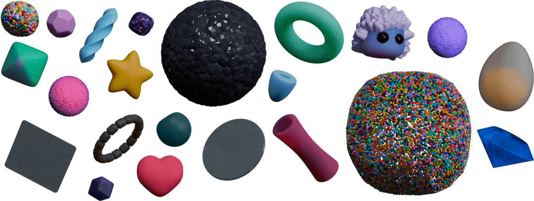
In my markup, I create individual <img> tags for each shape, using the object-position property to pan around inside the image and show a single shape. The code looks something like this:
<style>
  .decoration {
    object-fit: none;
    object-position: var(--x) var(--y);
    /*
      Support high-DPR screens by rendering at 50%
      of the image’s true size:
    */
    transform: scale(0.5);
  }
</style>

<img
  alt=""
  src="/images/shape-sprite.png"
  class="decoration"
  style="--x: -387px; --y: -125px; width: 120px; height: 240px"
/>
<img
  alt=""
  src="/images/shape-sprite.png"
  class="decoration"
  style="--x: -42px; --y: -201px; width: 456px; height: 80px"
/>
<!-- ...and so on, for all 22 shapes -->
This is pretty tedious work: using image-editing software, I go through the shapes one by one, measuring its distance from the top/left corner, as well as its width/height. I hardcode all of this data in a big JSON object, and then map over it and render an <img> tag for each one.
In order for images to look crisp on high-DPR displays like Apple’s Retina displays, the image is actually twice as big as its displayed size. I use transform: scale(0.5) to shrink it down to its intended size. Ideally, I should have two or three different versions of the spritesheet and swap between them based on the monitor’s display pixel ratio, but ultimately this’ll still look fine on standard displays.
By using a sprite, we also solve the problem of each image popping in whenever it finishes loading. Instead, I set it up so that the images would fade in sequence, starting from the center and moving outwards. Here’s what that looks like, at half-speed:
This fade animation uses a keyframe animation:
@keyframes fadeFromTransparent {
  from {
    opacity: 0;
  }
}
Then, I use animation-duration and animation-delay to create the staggered swelling effect:
<img
  alt=""
  src="/images/shape-sprite.png"
  class="decoration"
  style="
    --x: -42px;
    --y: -201px;
    width: 456px;
    height: 80px;
    animation-duration: 800ms;
    animation-delay: 200ms;
  "
/>
Each <img> element is given custom values for both animation-duration and animation-delay, based on their perceived distance from the center of the screen.I’m oversimplifying a bit here; I actually gave each element a “fadeScale” value between 0 and 1, and then normalized that value based on min/max values I could tweak to come up with the perfect sequence.
This works great on localhost, but it doesn’t work in production: keyframe animations start immediately, the moment the <img> element is created. It doesn’t wait for the image to be loaded!
Here’s how I solved that in React:
function ShapeLayer() {
  const [hasLoaded, setHasLoaded] = React.useState(false);

  React.useEffect(() => {
    const img = new Image();
    img.src = "/images/shape-sprite.png";

    img.onload = () => {
      setHasLoaded(true);
    };
  }, []);

  if (!hasLoaded) {
    return null;
  }

  // Once `hasLoaded` is true, render all of the shapes...
}
On first render, this component doesn’t specify any UI. It creates a detached dummy image and registers an onload handler. When the image has finished downloading, I change a state variable, which causes all of the <img> tags to be created. This way, the fade sequence only starts when the image is available.
Link to this headingFrosted glass pieces
Two of the assorted shapes are intended to be translucent, made of glass. I thought it would be fun if they also blurred anything that moved behind them. Using the bomb, you can reposition the glass shapes to sit in front of stuff, like this:

This was surprisingly tricky. Blender does include the transparency as part of its export, but it was too clear. It didn’t look realistic. Plus, the png compression added some weird artifacts:
I recently wrote about the backdrop-filter property, which allows us to apply a blurring algorithm to everything behind an element, but things didn’t quite work out:

backdrop-filter works based on the shape of the <img> DOM node. It’s not smart enough to only apply the blurring to the stuff behind the opaque pixels within the image!
To solve this problem, I used the clip-path property to draw a polygon in the shape of the glass pane, fiddling with the points until it looked right. Here’s the shape of that polygon:

The polygon() function doesn’t allow us to specify a corner radius for rounded corners, so our clipped area isn’t perfect, but it’s close enough to work well in this situation. 😄
Link to this headingThe synth
So this was totally unnecessary, but I built a fully-functional synthesizer. 😅

The synthesizer is revealed by transforming the signup form using the “wand” tool. It’s exclusive to the desktop experience.
The synthesizer is played either by clicking the keys with your mouse, pressing keys on a QWERTY keyboard, or with a MIDI controller. All of the sound it makes is generated live in-browser; no pre-recorded audio is usedA single audio file of a long echo is used for the convolution effect, enabled with the “Reverb” slider. I built it using the Web Audio API. Most stuff was built from scratch, though I did use tuna(opens in new tab) for some of the effects.
For most of the bells and whistles on this landing page, I tried to pick things strategically, showing off the things you’ll actually learn to build in the course. For this one, though, it was purely an exercise in self-indulgence 😅. We won’t cover the Web Audio API in the course.
That said, there are some pretty interesting UI details here too. For example: aside from the nameplate in the top-left corner, zero images are used. The UI was created entirely using layered gradients and shadows!
Doing this sort of “CSS art” can seem really intimidating, but it’s honestly not as scary as I expected. It’s actually pretty remarkable how good things look almost by default when you start layering gradients!
Like all good easter eggs, the synthesizer has 3 hidden features of its own. I won’t spoil them here, but I’ll give you some hints:
- One easter egg involves the “Whimsynth” nameplate.
- One easter egg involves the “hand” tool.
- One easter egg involves the “wand” tool.This one doesn’t work in Firefox. Sorry, FF users!
Link to this headingSound effects
If you’ve poked around with the landing page, you’ve likely discovered that just about everything has a sound effect.
This is a bit controversial; people generally don’t expect websites to make noise! But our devices do have volume controls, so it’s easy for people to opt out of sound. I think as long as our sound effects are tasteful and not too loud, we can get away with it.
Link to this headingWhere to find sounds
Lots of folks have told me that they’d love to start adding sound effects to their projects, but they don’t know where to find high-quality sound effects.
For years, my main source was freesound.org(opens in new tab). As the name implies, freesound is a huge database of free sound effects. They’re free in both senses of the word: you don’t pay anything to download them, and you’re free to use them however you wish, without restriction.
That said, browsing freesound often feels like a “needle in a haystack” situation. There are some real gems in there, but you need to sift through a lot of rocks to find them.
Alternatively, there are paid options. I used Splice(opens in new tab) to find this “industrial machinery” sample I used for the marble cannon on the confirmation page:
And finally, the thing I’ve been doing the most recently is recording my own sound effects! Most of the examples we’ll explore in this section were recorded by me, using a Zoom handheld recorder, experimenting with random objects in my environment. Not only is this incredibly fun, but it tends to produce the best results.
Let’s talk about some of the sound-related tricks I used on this page.
Link to this headingMultiple samples
One of my favourite techniques is to have multiple versions of each sound, to get a bit of natural variation.
This’ll be easier to explain with a demo. Try to drag the slider, with sound enabled. Flip between the two modes to hear the difference.
The Single sample mode plays the exact same sound every time the slider’s value changes, while the Multiple samples mode randomly picks one of five sounds I recorded each time. It’s a subtle difference, but the multi-sample approach feels a bit less robotic to me, a bit more natural. Especially when dragging the slider quickly.
This is why I’m such a big fan of recording my own sounds. Most existing soundbanks will give you a single “version” of a sound, but when we record our own, we can collect a palette of samples.
Link to this headingOn/off samples
For buttons, I play one sound when the button is pushed, and a separate sound when it’s released:
To make these samples, I tried pressing a bunch of buttons on various devices I had lying around the house. When I found something that matched the UI, I recorded myself pressing it a bunch of times, and selected the nicest samples.
Like in the previous example, I’m not playing the exact same sound each time. I have 6 total samples (3 pushing, 3 releasing).
In a similar vein, the magic wand uses a plunger sample, and I broke the sample up so that it plays the first half of the sound on mouse-down, and the second half on mouse-up:
Link to this headingProgress samples
One of the easter eggs in the synthesizer is the ability to "pull up" a secret button:
To make this feel more tactile, I recorded a series of ascending clicks. Specifically, I dragged a pen along the plastic fins of my humidifier, which naturally rose in pitch since the plastic fins get shorter towards the top.
Link to this headingMy use-sound hook
If you’re a React developer and you’d like to start adding sound effects to your projects, I have a lil’ library that can help! A few years ago, I open-sourced the custom hook I use, use-sound(opens in new tab).
Under the hood, it uses Howler.js(opens in new tab), a longtime battle-tested JavaScript library for playing sounds. So I’m delegating all the hard audio stuff to them.
To set expectations: it’s not a project I’m actively maintaining, in the traditional sense. I don’t really look at the issues or PRs. But I use it in my own projects and it works well for me, so I figured I’d make it available for anyone else who wants to use it!
Link to this headingFireworks
Before the course launched, I had a waitlist that users could sign up for. After entering their email, they saw the following success screen:
By default, this effect is pretty tame, but things can get pretty wild using the FIREWORKS PER SECOND slider at the bottom of the screen. 😄
I created these fireworks from scratch using 2D Canvas. No additional libraries were used. The code honestly isn’t too scary; it’s a bunch of smaller ideas (like polar coordinates!) combined to create something that feels complex.
We’ll build this effect in the course. And in the process, you’ll learn the underlying techniques that can be used to build all sorts of celebratory effects.
As I mentioned earlier, my main goal with this course is to give you the tools you need to create your own interactions and animations. The web is full of generic NPM-installed confetti and formulaic ChatGPT-generated effects, and they fail to spark joy because we’ve all seen them 100 times before.
A crucial ingredient for whimsy is novelty. A charming, delightful effect becomes mundane and annoying surprisingly quickly! So I’m not really interested in giving y’all a handful of “whimsy formulas”, or snippets that you can copy/paste. I want to teach you the core building blocks you can use to design and build effects that are unique to you. ✨
Link to this headingIn conclusion
There’s so much more I could share, like the physics of explodable content or the dozens of people who submitted translations for the main tagline, but this blog post is way too long already. 😅
If you have any questions about this landing page, or my upcoming course, you can shoot me a message(opens in new tab), or hit me up on Bluesky(opens in new tab).
And if you’d really like to learn how to do stuff like this, from conception through implementation, you should join the course! Registration is now open. You can learn more here:
Thanks for reading! ❤️
Last updated on
May 5th, 2026