One of my all-time favourite CSS tricks is using backdrop-filter: blur() to create a frosted glass effect. I use it in just about every project I work on, including this blog!
Here’s a quick demo, to show what I’m talking about:
This effect helps us add depth and realism to our projects. It’s lovely.
But when I see this effect in the wild, it’s almost always missing some crucial optimizations. A couple of small changes can make our frosted glass so much more lush and realistic!
In this post, you’ll learn how to make the slickest frosted glass ever ✨. We’ll also learn quite a bit about CSS filters along the way!
Link to this headingCSS filters
To briefly explain the underlying concept: CSS gives us quick and easy access to SVG filters via the filter property.
For example, we can give elements a Gaussian blur with filter: blur():
There are lots of fun filter options, the sorts of things you’d find in image-editing software. Like, rotating the hue of all the colors:
In these examples, I’m applying the filters to an <img> tag, but we can apply them to standard DOM nodes as well:
Lorem Ipsum is simply dummy text of the printing and typesetting industry. Lorem Ipsum has been the industry's standard dummy text ever since the 1500s, when an unknown printer took a galley of type and scrambled it to make a type specimen book. It has survived not only five centuries, but also the leap into electronic typesetting, remaining essentially unchanged.
Pretty neat, right?
Things get even cooler with backdrop-filter. This property lets us apply these same filters to the stuff behind a given element.
For example:
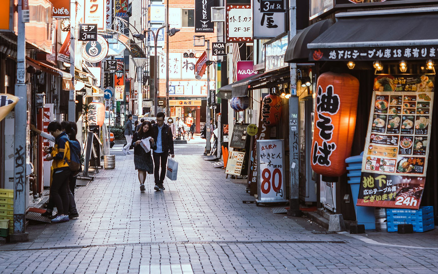
In this demo, the .magic-ring element sits in front of a photo ( source(opens in new tab)). It uses the backdrop-filter property to apply some filtering to everything behind it, which can be used for some pretty artistic effects.
In practice, I pretty much only use backdrop-filter for one use case: blurring everything behind an element, usually a header, to create the “frosted glass” effect I mentioned earlier:
Alright. Let’s talk about the thing most developers miss.
Link to this headingThe Issue
Here’s the problem: The backdrop-filter algorithm only considers the pixels that are directly behind the element.
For filters like brightness or hue-rotate, that makes perfect sense. With blur, though, we actually want to consider pixels that are near the element too.
This is one of those things where a demo is worth a thousand words. Check out the difference:
By default, the gaussian blur algorithm is applied to all of the pixels behind the element. This means that if a big colorful element is near the element, it won’t have any effect.
That’s not really how frosted glass works in real life though. Light bounces off of objects and then goes through the glass. It looks so much better when the blurring algorithm includes nearby content.
Unfortunately, this isn’t something we can configure directly. Instead, we need to be a bit crafty.
Here’s the code:
Code Playground
Result
It looks complicated, but the principle isn’t too scary.
If we want the blur to consider elements nearby, we need to extend that element so that it covers those elements. Then, using a mask, we trim the excess away, so that it’s visually the same size as we originally intended.
Let’s walk through it step by step. First, we have a header with a backdrop blur:
Code Playground
Result
Because the red ball isn’t behind the header at all, it isn’t being considered by the blurring algorithm, and so we don’t get that soft red glow. We need to extend the header so that it covers at least some of the ball.
Rather than give the <header> an explicit height (which would lock us into a specific size, rather than a dynamically-calculated one), let’s move the backdrop-filter to a child element, and set that child element to be twice as large as its parent:
Code Playground
Result
Alright, now we’re getting somewhere! The .backdrop child grows to cover most of the red ball, blurring it correctly.
Now, we don’t actually want to see all of this excess backdrop. We need to trim it back to the size of the <header> parent element.
Maybe we can solve this with overflow: hidden?
Code Playground
Result
What you see here depends on your browser. On Firefox and Safari, this works great! But sadly, it doesn’t work on Chrome. There’s no soft red glow.
I think it’s an order-of-operations issue. In Chrome, the overflow trimming occurs before the filters are applied, so when the blurring algorithm is executed, the content has already been hidden.
For the same reasons, we can’t use overflow: clip or clip-path, but fortunately, we can use mask-image. The masking algorithm happens after the filters, in all browsers. ✨
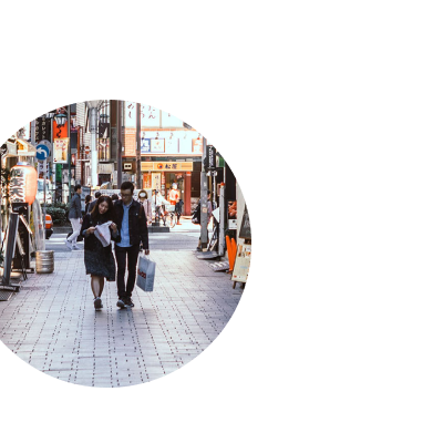
Masking is a huge topic which is well beyond the scope of this tutorial, but the basic idea is that we can specify how transparent parts of an element should be. For example, if our mask is an opaque circle in a transparent box, that opaque shape can be applied to any other element:


Most commonly, masks are images in a format that supports transparency (like .png or .gif), but we can also use gradients as masks. For example, we can fade an image from opaque to transparent:
Code Playground
Result
For our glassy header optimization, we’re using mask-image to make the original header size fully opaque, and everything past that point fully transparent. Essentially our mask looks like this:
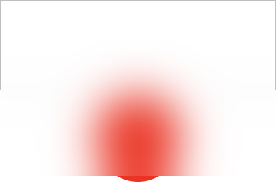
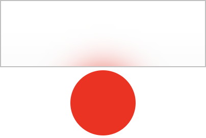
The relevant code looks like this:
.backdrop {
  height: 200%;
  mask-image: linear-gradient(
    to bottom,
    black 0% 50%,
    transparent 50% 100%
  );
}
Our mask doesn’t look like a gradient, does it? I typically picture gradients fading smoothly from one color to the next.
It might feel like an Term from the LEGO world, referring to assembling LEGO bricks in a way that the manufacturer did not intend., but this is what we need in this case. Our gradient is solid black from 0% to 50%, then it instantly becomes transparent for the final 50%.
Why 50%? We set height to 200%, so that .backdrop will always be twice as tall as its container. The percentages inside mask-image’s gradient are relative to the current element’s size.
For example, if our <header> is 200px tall, our .backdrop will grow to 400px (200% of its parent). Then, our mask will show the first 50% of this element (0px to 200px), and hide the rest (200px to 400px).
Here’s the code again. Feel free to experiment with it, to develop your intuition for what’s happening:
Code Playground
Result
This is the basic idea behind this solution, but there’s a bug we need to fix, and a couple more optimizations we can consider.
Link to this headingPointer events
Our current implementation has a pretty big issue: nearby elements become unclickable and unselectable.
Try to select the text just below the header:
Code Playground
Result
Here’s what happens when I try on desktop:
Here’s the problem: the mask-image property will visually hide parts of an element, but the element is still there. We’re not able to click on the text because that .backdrop is extending out and covering it!
Fortunately, it’s an easy fix:
.backdrop {
  position: absolute;
  inset: 0;
  height: 200%;
  backdrop-filter: blur(16px);
  mask-image: linear-gradient(
    to bottom,
    black 0% 50%,
    transparent 50% 100%
  );
  pointer-events: none;
}
The pointer-events property allows us to specify that an element should be ignored when resolving click/touch events. mask-image makes the backdrop invisible, and pointer-events: none makes the backdrop Something that can be seen but not felt, like a mirage or a ghost.
This is another reason why .backdrop needs to be a child element. We don’t want the <header> itself to ignore clicks, since it typically has navigation links. We want to target the frosted glass element specifically.
Link to this headingFlickering top
By extending the glassy backdrop below the header, we can ensure that the blurring algorithm takes it into consideration even before that element reaches the header.
But what about when things leave the top of the viewport?
Things aren’t quite so nice. Scroll down slowly in this demo:
Notice that weird goopy flickering, at the very top of the viewport?
It’s the same issue as before. The gaussian blur algorithm is only considering the pixels directly underneath it. When a yellow longboard is scrolled out of view, for example, that data is no longer factoring into the blur algorithm, causing those unnatural color flickers.
Unfortunately, we can’t re-use our solution here. As far as I can tell, elements outside the viewport are never considered by backdrop-filter(), even if the elements are layered correctly.
The best solution I’ve found for this solution is to add a gradient that covers the flickering:
Here’s the code:
.backdrop {
  position: absolute;
  inset: 0;
  height: 200%;
  background: linear-gradient(
    to bottom,
    /*
      Replace this with your site’s
      actual background color:
    */
    hsl(0deg 0% 0%) 0%,
    transparent 50%
  );
  backdrop-filter: blur(16px);
  mask-image: linear-gradient(
    to bottom,
    black 0% 50%,
    transparent 50% 100%
  );
  pointer-events: none;
}
Until now, the .backdrop element has been fully transparent; we haven’t applied a background at all. This gradient makes it opaque at the very top, blocking the flickering colors from view, but fading to transparent, to show the frosted glass effect.
Link to this headingThicker glass
In some circumstances, the frosted glass effect can be a bit distracting:
This feels too “busy” to me; the blurry text sitting behind the header makes the site name and navigation too hard to read. It all feels a bit messy, and not as subtle as I want.
There are two main ways to fix this. We could increase the blur radius:
Or, we could add a background-color to the parent <header>, making it semi-opaque:
(We could also tweak the gradient we added in the previous section, making it fade from fully-opaque to semi-opaque, but I prefer to keep the two things separate, so that I can tweak them independently.)
Link to this headingBrowser support
backdrop-filter has been around in all major browsers for a number of years now; according to caniuse(opens in new tab), it’s above 97% support as I write this in December 2024. For our main optimization, we also need mask-image, which is almost as well supported(opens in new tab), sitting at 96.3%.
Both properties require a -webkit prefix for some browsers, but most CSS tooling will add this for you automatically.
At the bottom of this blog post, I’ll include the full copy-ready code, which uses feature queries to make sure that older browsers still have a usable experience. They won’t get the frosted glass effect, but everything will still be readable and usable.
Link to this headingGlassy edge
As if this stuff wasn’t complicated enough already, Artur Bien came up with an extra twist; we can create the illusion of a 3D piece of glass by adding a second blurred element with different filter settings:
Isn’t that lovely?!
Here’s how this works: The bottom edge is a separate DOM node with its own backdrop-filter. I find it looks better with a smaller blur radius (eg. 8px in the bottom edge, 16px in the main backdrop), and with an extra brightness filter to really make it pop. ✨
The code for this is a bit gnarly 😅. I’ve done my best to explain it in the comments below:
<style>
  .backdrop {
    position: absolute;
    inset: 0;
    height: 200%;
    border-radius: 4px;
    background: hsl(0deg 0% 100% / 0.1);
    pointer-events: none;
    backdrop-filter: blur(16px);
    mask-image: linear-gradient(
      to bottom,
      black 0,
      black 50%,
      transparent 50%
    );
  }

  .backdrop-edge {
    /* Set this to whatever you want for the edge thickness: */
    --thickness: 6px;

    position: absolute;
    inset: 0;
    /*
      Only a few pixels will be visible, but we’ll
      set the height by 100% to include nearby elements.
    */
    height: 100%;
    /*
      Shift down by 100% of its own height, so that the
      edge stacks underneath the main <header>:
    */
    transform: translateY(100%);
    background: hsl(0deg 0% 100% / 0.1);
    backdrop-filter: blur(8px) brightness(120%);
    pointer-events: none;
    /*
      We mask out everything aside from the first few
      pixels, specified by the --thickness variable:
    */
    mask-image: linear-gradient(
      to bottom,
      black 0,
      black var(--thickness),
      transparent var(--thickness)
    );
  }
</style>

<header>
  <div class="backdrop"></div>
  <div class="backdrop-edge"></div>
</header>Link to this headingThe final code
Phew! We covered a lot of ground in this one.
Here’s the final code, with all of the optimizations we’ve discussed. I’ve also included feature queries, to make sure that our website remains legible on older browsers.
Feel free to copy this code, and make it your own! This is intended to be a starting point, not a complete solution. For example, you may wish to tweak the size of the backdrop’s overlap for your particular circumstances.
Code Playground
Result
Link to this headingContinue learning
If you’ve enjoyed this blog post, you might like to know that I have an entire course about CSS!
It’s called CSS for JavaScript Developers(opens in new tab), and it’s built using the same tech stack as this blog: it’s chock full of interactive articles, demos, and opportunities to experiment. There are also bite-sized videos, exercises, workshops, and even a few mini-games!
You can learn all about my course here:
Last updated on
April 27th, 2026
