Back in the day, there was a gold-standard website layout that everyone strived to create, but that was notoriously difficult to get right: the .
It doesn't seem like it would be so tricky, right? But this was an era before flexbox existed; our tools for the job were tables and floats, and neither were really up to this task. It was technically possible, but some shenanigans were required.
Once flexbox achieved mainstream browser support, this layout went from "holy grail" to "fountain drink"; it was everywhere, because it offered a great user experience, and was within reach for all developers.
As the web has evolved, I've discovered a new aspirational layout. It offers a fantastic user experience, especially for long-form text content like news articles or documentation. But, like its predecessor, it's been deceptively hard to achieve; most implementations require obscure hacks or counterintuitive tricks.
I recently discovered an elegant solution to this problem using CSS Grid. In this post, we'll learn how it works!
Link to this headingThe Problem
Have you ever tried to read Wikipedia on a very large screen? It looks like this:
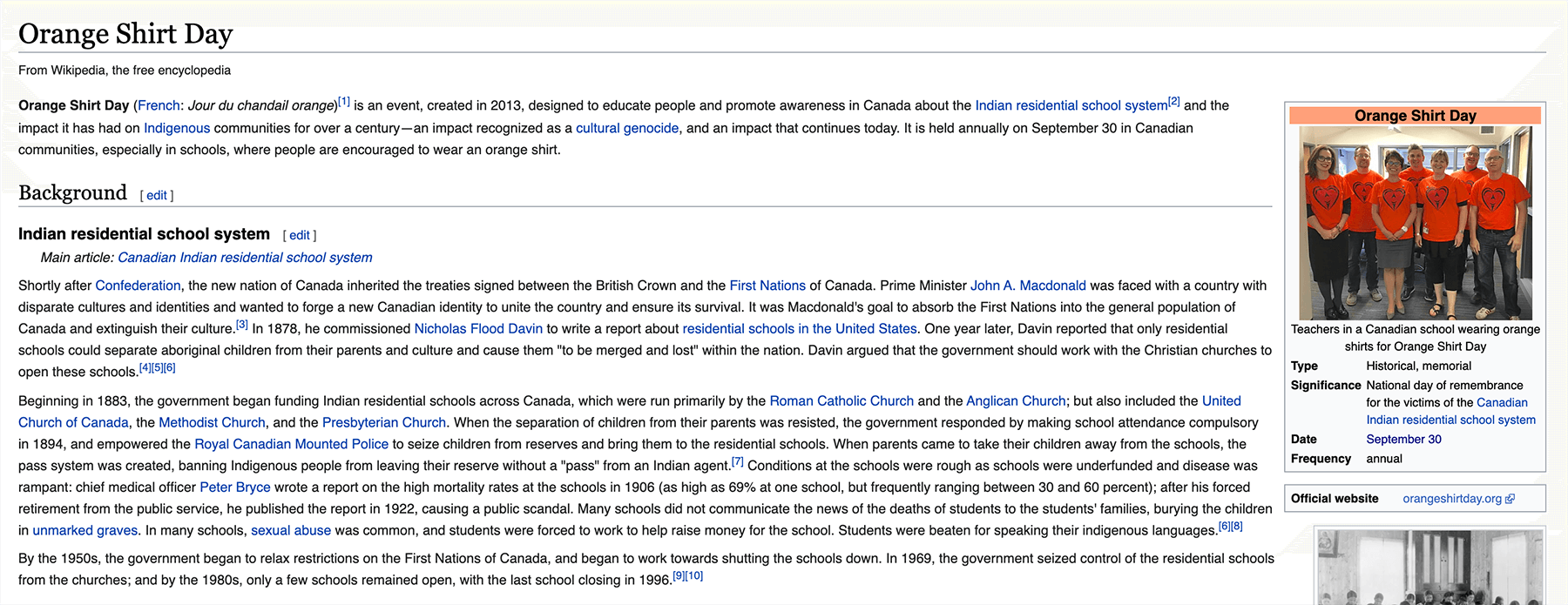
Those paragraphs are so wide! Wikipedia doesn't constrain the container width at all. This leads to lines that are hundreds of characters in length.
It's hard for our eyes to wrap around when we reach the end of a line. If you're like me, you wind up using your mouse to assist:
In addition to the line-wrapping concern, it's just generally hard to read lines of text that are so wide; it fatigues the eye.
Research has shown(opens in new tab) that the ideal line length is about 65 characters. Anywhere between 45 and 85 is generally seen as acceptable, in the context of a roman alphabet. Reading is a complex process(opens in new tab), and we should strive to make it as easy as possible.
The standard solution to this problem is to create a single fixed-width column in the center of the page. You've seen this layout everywhere: online magazines, documentation, news sites, and blogs. You're looking at it right now, on this site!
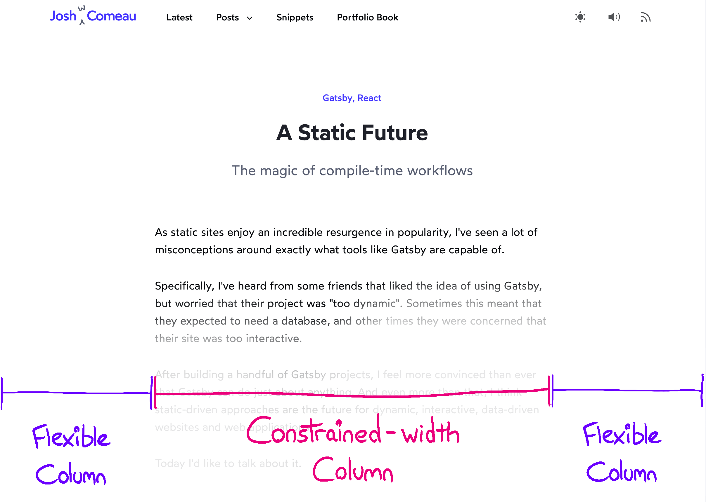
There's a complicating factor, however—not all content should be constrained. We should allow images, videos, and custom widgets to break free and fill the available width:

This meerkat used as an example of a child that breaks free of constraints. Photo By Sean Paul Kinnear.
The common term for this kind of thing is “full-bleed”. It's a term borrowed from the publishing world; when something is printed full-bleed, it extends to the very edge of the paper.
This new requirement makes the problem considerably more tricky. CSS doesn’t really give us many options for having a child ignore its parent’s width, and most of them have significant trade-offs.
Link to this headingThe Solution
Let's start at the end, with our solution:
.wrapper {
  display: grid;
  grid-template-columns:
    1fr
    min(42rem, 100%)
    1fr;
}

.wrapper > * {
  grid-column: 2;
}

.full-bleed {
  width: 100%;
  grid-column: 1 / 4;
}
These styles are assigned to markup in this shape:
<main class="wrapper">
  <h1>Some Heading</h1>
  <p>Some content and stuff</p>
  <img class="full-bleed" alt="cute meerkat" src="/meerkat.jpg" />
</main>
There's a lot to unpack here, so let's go through it step by step.
Link to this headingThe Grid
.wrapper {
  display: grid;
  grid-template-columns:
    1fr
    min(42rem, 100%)
    1fr;
}
If you're not familiar with CSS Grid, this might seem like a lot of random characters and keywords. Never fear! All will be explained.
grid-template-columns is a property that lets us define the shape of our grid. By providing 3 discrete values, we're indicating that we want 3 columns.
The values define the width of each column. The first column is 1fr, same as the last column. The fr unit is a flexible unit that fills available space. It's similar in principle to flex-grow; it's a ratio of how much of the free space the column should consume.
Our center column is a fixed width. In this hypothetical example, I want that column to have a maximum width of 42rem, since that’s the value that allows for 65-character lines. You’ll have to do some experimentation to find the right width, which will depend on your font-family and font-size.
On smaller screens, where there isn’t enough horizontal space for 65 characters, it’s clamed to 100% of the available space. I’m using the min() function to pick between the two values.
(If you use Sass, the min keyword won't work properly, because it's already a helper in the preprocessor. View a workaround(opens in new tab).)
Here's what this looks like, in practice:
Link to this headingAssigned Children Column
We've defined a 3-column grid, and now it's time to assign children to it.
By default, children will be slotted into the first available grid cell. We want to override this default behaviour though; all children should sit in the center column, leaving the first and third columns empty.
.wrapper > * {
  grid-column: 2;
}
In CSS Grid, columns are 1-indexed, so 2 is a reference to the middle column.
The asterisk (*) is a wildcard; it'll match elements of all types. We're saying that every child should be assigned to that second middle column. Each new child will create a new row, like so:
Link to this headingFull Bleed Children
We've seen how our grid can constrain elements of all types, but what about when we want a child to break free and fill the available width?
That's where this fella comes in:
.full-bleed {
  width: 100%;
  grid-column: 1 / 4;
}
This special .full-bleed class allows a specific child to bust out of that column, and span all 3 columns. 1 / 4 is a start/end syntax; we're saying the element should start on Column 1 (inclusive) and span all the way to Column 4 (exclusive).
The trick is that each child becomes its own grid row, and each child can fill as much of that row as it wants. Most elements will only ever occupy that center column, but some will instead span all 3.
Link to this headingPadding
On smaller screen-sizes, we want to add a bit of padding, so that our text isn't right at the edge of the display.
One way to do this is to use the gap property, to add some space between the three columns. In order for this to work, we also need to reduce the width of our main column by the same amount:
.wrapper {
  --viewport-padding: 16px;
  display: grid;
  grid-template-columns:
    1fr
    min(42rem, calc(100% - var(--viewport-padding) * 2))
    1fr;
  gap: 0 var(--viewport-padding);
}
This works, but honestly, that grid-template-columns declaration is getting pretty gnarly 😅. I try to keep my code as simple as possible, so that I’ll be able to understand it as quickly as possible when I come back to it in the future.
Another option is that we could add some inline padding on the grid container, and cancel it out with negative margin on the full-bleed children:
.wrapper {
  --viewport-padding: 16px;
  display: grid;
  grid-template-columns: 1fr min(42rem, 100%) 1fr;
  padding-inline: var(--viewport-padding);
}

.full-bleed {
  grid-column: 1 / -1;
  margin-inline: calc(var(--viewport-padding) * -1);
}
This is a much less sophisticated approach, but honestly, I think I like this more, since I feel like I’d be able to make sense of it more quickly in the future. But ultimately, I think both approaches work well, so feel free to solve it however you like!
Link to this headingCSS for JavaScript Developers
Let me ask you a question: how comfortable do you feel with CSS?
I know a lot of JS devs who find CSS frustrating and anxiety-inducing. They're proficient with the basics, but they can't seem to develop mastery, to be able to write CSS with confidence.
I was in this boat, and I was sick of it. So I went deep, learning about how the browser interprets and renders CSS. It took years, but the end result is that I feel so much more confident with the language now.
I've distilled this knowledge into an online course called CSS for JavaScript Developers(opens in new tab). It's an interactive course, leveraging the same techniques I use on this blog to write dynamic content that can be poked and prodded. I'm so confident in this idea, I left my job as a staff software engineer at Gatsby Inc. to work on it full-time 😱
Link to this headingConclusion
CSS Grid is super powerful, and now that it's achieved wide browser support(opens in new tab), it can solve so many of our problems!
Some readers have suggested that the same effect could be accomplished with flexbox, or without the use of a wrapper at all. Unfortunately, there are some trade-offs that make those alternatives unworkable. It's beyond the scope of this article, but I wrote up a couple points in this HackerNews comment(opens in new tab).
The historical solution to this problem uses negative margins. It works perfectly well, but it feels a bit hacky to me. You can read more about that solution on CSS Tricks(opens in new tab).
One more thing: don't be afraid to tweak these styles! This recipe is meant to be used as a starting point. For example, you may wish to apply a max-width to the container, to constrain the full-bleed children on ultra-wide monitors. There's all sorts of fun stuff you can do beyond what's covered in this tutorial; you can learn more about them in my CSS course(opens in new tab)!
Last updated on
December 13th, 2025