I recently got the following message in a DM:
I’ve been building with HTML and CSS for years, and I still don’t know how to implement pixel-perfect designs
If you're not familiar with the term, "pixel-perfection" is the idea that your HTML/CSS implementation should be as close to the original mockup as possible. Measurements and spacing should be exact, down to the pixel.
I hear this concern a lot; even after years of experience, many front-end developers struggle to perfectly reproduce a design.
When designers hand us a completed mockup, they're trusting us to faithfully implement their vision. Their work is funnelled through our implementation, and they're keeping their fingers crossed that we don't mangle it too much in the process.
How exactly do we produce something that our designers will be proud of? Is it even realistic to reproduce a design down to the pixel? Why is this so hard?
In this article, we'll answer these questions, and learn some tricks to help us scooch a bit closer to pixel-perfection ✨
Link to this headingPixel-pretty-close
Let's get this out of the way upfront: In a strict letter-of-the-law sense, I don't think pixel perfection is actually possible.
The HTML and CSS we write will need to run on a dizzying array of various devices. There are so many variables that impact how an implementation will render.
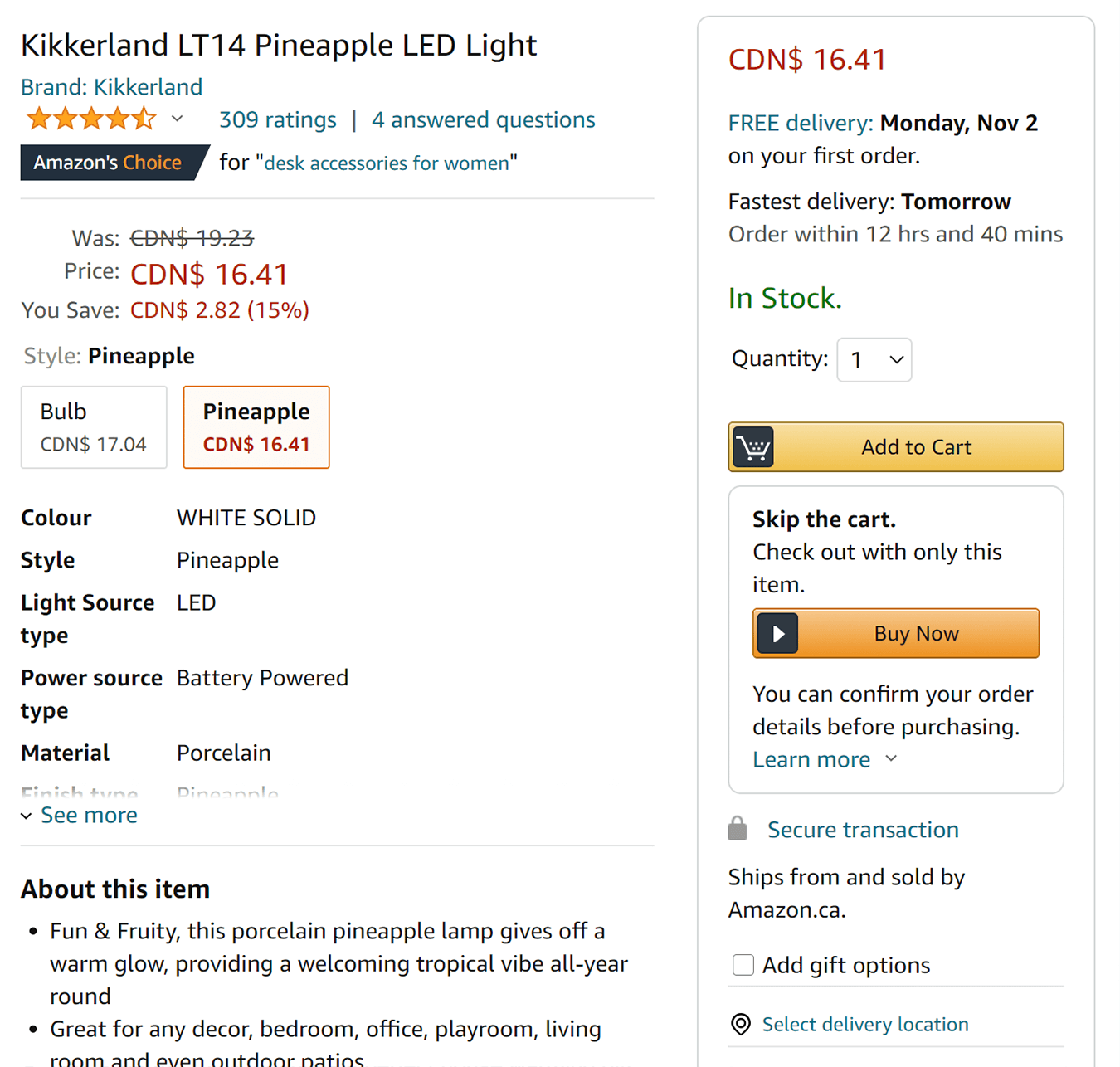
For fun, I captured screenshots of the exact same Amazon listing across two different devices.
Use the buttons below to toggle between them, to see the differences:
Chrome, Windows
Safari, MacOS
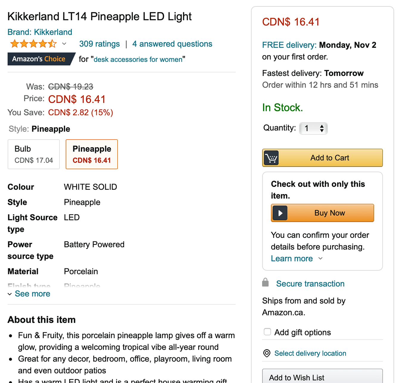
When viewed side-by-side, these two screenshots seem pretty darn similar, but when toggling between them, it's clear that they aren't identical. They contain very different pixels.
When I worked for DigitalOcean, I was able to go on a tour of one of their datacenters. It was wild and surreal; enormous rooms held hundreds of rows, each with dozens of racks, each with dozens of computers. Every machine was identical.
I get jealous of backend developers sometimes. There are plenty of hard problems on the backend, don't get me wrong, but at least they control the devices that their code runs on! It doesn't have to run on every imaginable device, from a 5" phone to a 72" TV to a smart-fridge.
In the demo above, I only changed two variables: The operating system and the browser. Think about how many other factors affect what gets painted:
- Device type (desktop, laptop, tablet, phone, watch...)
- Screen size / window size
- Screen pixel density
- Screen technology (OLED, LCD, CRT, E-ink)
- User zoom level / default font size
- Performance (device hardware, server load, network speeds...)
- Device color correction (eg. Night Mode)
That's just off the top of my head; I bet you have a couple I missed!
So it's clear that we will never be able to ensure 100% consistency when it comes to the RGB values of the individual pixels on the screen. It's an impossible standard. But it's also not really the point.
Nobody is asking for things to look the same under a magnifying glass. Mostly, designers want the implementation to look near-identical to the naked eye, and to have obvious misalignments and loosey-goosey spacings tightened. They want it to be pixel-pretty-close, not pixel-perfect.
Let's talk about how we can do that.
Link to this headingMeasuring distances
When you receive a fresh mockup, hot off the presses, it's usually delivered to you in some sort of design tool, like Figma or Zeplin.
These tools are awesome, because unlike a static image, they're live representations of the design. You can select individual elements and pluck out colors and sizes.
Unfortunately, this information is not always trustworthy! Just because Zeplin tells you that there's a 64px gap between the heading and the paragraph doesn't mean it's correct.
Tools like Sketch are fundamentally design tools; they inherit a set of practices and idiosyncrasies from the design world, and they don't always map neatly onto the web. They'll be close, sure, but not necessarily close enough.
Instead of trusting the measurements you get from design tools, you should take your own measurements! My favorite way to do this is using the built-in screenshot tool in MacOS:
You can toggle this feature on with the keyboard shortcut cmd-shift-4. Click and drag to draw a box, and use the numbers in the bottom-right to gauge distance. If you release the mouse, it'll take a screenshot, or you can hit the Escape key to cancel it, to avoid cluttering your desktop with a bunch of images.
Other operating systems don't have this sort of thing built in, but I've found a few alternatives: Greenshot (Windows) and ScreenRuler / KRuler (Linux).
Be sure to measure both the mockup and your implementation! Tweak as needed until the numbers are the same. And measure the distance to the actual letters, not some imaginary box around them!
Work on spotting differences. Arrange your windows so that the mockup and your implementation are side-by-side, and look for subtle differences. Treat it like one of those spot-the-difference games.
There are also tools like PixelSnap. PixelSnap is a tool that lets you quickly and easily measure just about everything on the screen, using a bunch of advanced tools. It's paid software, but you might be able to convince your employer to pick up some licenses for the team!
Link to this headingGoing the extra mile
Take a look at the following two circles. Which would you say is correctly centered?

The second one looks better, doesn't it? And yet, the first one is the technically correct answer.
In CSS, everything is boxes. The number "1" produces a box around it, and that box is perfectly centered.
The one on the right has been shifted, so that its stem aligns with the vertical axis:

This is known as optical alignment. It's aligned based on human perception, not based on the absolute mathematical distance between boxes.
Admittedly, this is a really small detail, and it becomes impractical if the numbers are data-driven. But it's a good example of how mathematical centering doesn't always feel right. Sometimes, we need to make small tweak so that our eyes believe that things are properly aligned.
I frequently find myself needing to make slight shifts like this. Let's look at another example. Toggle between the two options, and see which one feels better to you:
If we use the element inspector, we see that the content box includes a few pixels of dead space before the left edge of the typography:
Happily, the kerning that causes this gap does seem to be consistent across browser rendering engines, and so we can safely shift things by a few pixels for universally-improved alignment.
To be clear, I know that this is super subtle. You can achieve really sharp designs without doing this optical-alignment stuff. We're in "last 5%" territory. But it does make a difference, and for mission-critical pages (homepage, high-traffic landing pages), it can be worth spending a few minutes on these tweaks!
Link to this headingA shifty component
You may have noticed a pattern in this article: lots of small tweaks to make things feel right.
It can feel chaotic to be constantly shifting things around. To add a bit of a constraint, and to ensure a consistent strategy is used, I like to create a little React component for myself. Here's what it looks like:
jsx
Here's how it's used:
jsx
Even if you're not familiar with react, hopefully this snippet gives you a sense what it's doing. our ShiftBy component allows us to shift something by a few pixels along either axis.
I like this because it's very clear what the intent is; we're making minute adjustments to make things feel well-aligned. We aren't sprinkling random bits of CSS across a bunch of pre-existing elements, seemingly at random.
transform: translate is the least invasive way I know to shift something. Unlike using margins, it won't pull siblings along for the ride.
You'd be surprised how often this component comes in handy. For example, I do a slight amount of shifting to the custom bullets in my unordered lists:
- Item 1
- Item 2
Aligning them to center or baseline don't feel quite right, so I tweak them by a few pixels until they sit well with my eyes.
Link to this headingBecoming confident with CSS
CSS is a deceptively tricky language. It's relatively easy to get started, tweaking typography styles and moving things around. But real-world projects are never that straightforward, and things get complex fast.
In this article, we've seen how small tweaks can make a big difference, but we haven't talked at all about how to get things in a close-enough shape for these small tweaks to work!
I know a ton of JS developers who don't feel confident with CSS. They understand the syntax and have no problem applying styles, but they haven't been able to bridge the gap to mastery; they aren't comfortable doing large-scale layout work, or coming up with a scalable architecture.
I'm working on a course called CSS for JavaScript Developers. It's a multi-modality course, leveraging the same technology I use on this blog to build dynamic and interactive widgets, and I'm taking it to a whole new level.
If you'd like to feel more comfortable with CSS, I think it'll really help! Learn more about the course.
Link to this headingWorking with design
In this article, we've talked a lot about the technical side of things. But there's another aspect to this.
I've written before that fostering a good working relationship with design is absolutely essential for doing great work. If you haven't read it, you should check it out; I think it's one of the most impactful blog posts I've published.
The truth is that there are times that our experience as front-end engineers is valuable. For example, the designer might have a great idea for a beautiful <select> element, and wish for it to be pixel-perfect… but their design wouldn't be as accessible as a native form control. Sometimes, platform defaults are more reliable than custom UI elements, and it's our job to advocate for them. This requires a good working relationship!
When designers request that some pixels are shifted around, don't call them "nits". I wouldn't want someone else to put that label on my work! Designers often feel bad for burdening us with their requests, when really it's often our fault for dropping the ball in the first place!
Link to this headingClosing thoughts
If you've ever tried to design something from scratch, you've likely found it frustrating; you can pick the same beautiful colors and lush fonts as a product like AirBnb, but wind up with something that looks amateurish and unprofessional.
At one of my first jobs, we bought a beautiful-looking template, but after implementing a few custom features, it looked like crud. We didn't change that much; why did it look so much worse??
The truth is that designs tend to be pretty fragile when it comes to spacing and consistency. If you shift a few things out of place, the whole thing collapses like a house of cards.
That's why this stuff matters. It isn't just about appeasing the designer on your team. If you were to interview users, I doubt anyone would be able to articulate any of this stuff. Nobody's complimenting the consistent spacing around elements! And yet, it has an impact.
Most folks don't see things with that level of granularity. They take in a page in its entirety, and make a judgment based on feel. Either it feels good and professional, or it feels bad and sloppy.
My partner's brother is a "typical" internet user; he's a music student, and isn't interested in design or development. I once solicited feedback from him about something I was working on, and he said that it looked “real”. Most successful online businesses are well-designed and thoughtfully implemented; if yours isn't, it won't appear as legit. Good implementation helps build credibility.
A single shift of a few pixels won't make or break a site, but it adds up. This is death-by-a-thousand-papercuts territory; in aggregate, this stuff makes a huge difference.
Platform differences make it impossible to hit "true" pixel-perfection, but in practice, this isn't a big deal. We can't guarantee a universal consistency, but we can ensure that each experience is internally consistent, and is faithful to the spirit of the design. That's the most important thing.