In CSS, we're given a tool to explicitly control the stacking order of HTML elements: z-index. Elements with a higher value will appear on top:
Code Playground
Result
Because .first.box has a larger z-index than .second.box, it stacks in front. If we remove that z-index declaration, it falls to the back. The code above is editable—give it a shot!
Things aren't always so simple, however. Sometimes, the larger z-index value doesn't win.
Check out what's going on here:
Code Playground
Result
.tooltip has a much larger z-index than header! So why on earth is the header on top?
To unravel this mystery, we'll need to learn about stacking contexts, an obscure-yet-fundamental CSS mechanism. In this article, we'll explore what they are, how they work, and how we can use them to our advantage.
Link to this headingLayers and groups
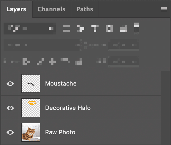
If you've ever used image-editing software like Photoshop or Figma, you're probably familiar with the concept of layers:

Our image has 3 separate canvases, stacked like pancakes. The bottom layer is a cat photo, with 2 layers on top that add silly details. By flattening these layers, we wind up with a final composition:

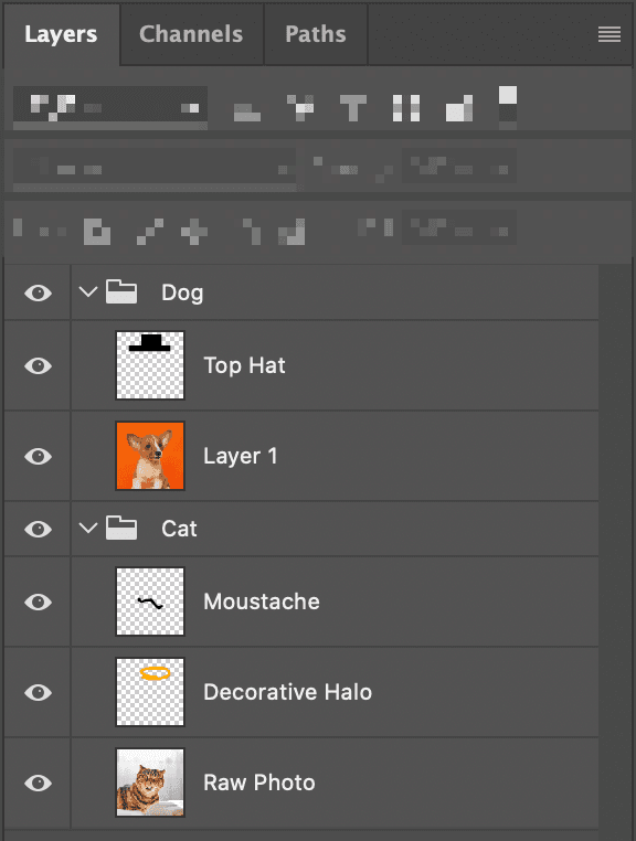
In these programs, we can also group layers:

Like files in a folder, a group allows us to segment our layers. In terms of stacking order, layers aren't allowed to “intermingle” between groups: All of dog's layers will appear on top of all of cat's layers.
When we export the composition, we don't see the cat at all, since it's behind the dog:

When it comes to CSS, things work in a similar way: elements are grouped into stacking contexts. When we give an element a z-index, that value is only compared against other elements in the same context. z-index values are not global.
By default, a plain HTML document will have a single stacking context that encompasses all nodes. But we can create additional contexts!
There are many ways to create stacking contexts, but here's the most common:
.some-element {
  position: relative;
  z-index: 1;
}
By combining these two declarations, a secret mechanism is triggered: a stacking context is created, forming a group around this element and all of its children.
Let's take another look at our problem from above:
<style>
  header {
    position: relative;
    z-index: 2;
  }
  .tooltip {
    position: absolute;
    z-index: 999999;
  }
  main {
    position: relative;
    z-index: 1;
  }
</style>

<header>
  My Cool Site
</header>
<main>
  <div class="tooltip">
    A tooltip
  </div>
  <p>Some main content</p>
</main>
We can map out the stacking contexts being created in this snippet:
- The root context
<header><main><div class="tooltip">
Our .tooltip element has a z-index of 999999, but that value is only relevant within the <main> stacking context. It controls whether the tooltip shows up above or below the adjacent <p> tag, nothing more.
Meanwhile, in the parent context, <header> and <main> are compared. Because <main> has a smaller z-index, it shows up underneath <header>. All of its children come along for the ride.
Link to this headingFixing our example
How do we solve our tooltip problem? Well, in this case, we don't actually need to create a stacking context on our <main>:
Code Playground
Result
Without a z-index, <main> won't create a stacking context. Our hierarchy, then, looks like this:
- The root context
<header><div class="tooltip">
Because the header and our tooltip are now in the same context, their z-index values face off, and the tooltip emerges as the victor.
An important distinction: we're not talking about parent/child relationships here. It doesn't matter that the tooltip is more deeply nested than the header. The browser only cares about stacking contexts.
Link to this headingCreating stacking contexts
We've seen how we can create a stacking context by combining relative or absolute positioning with z-index, but it's not the only way! Here are some others:
- Setting
opacityto a value less than1 - Setting
positiontofixedorsticky(No z-index needed for these values!) - Applying a
mix-blend-modeother thannormal - Adding a
z-indexto a child inside adisplay: flexordisplay: gridcontainer - Using
transform,filter,clip-path, orperspective - Using
will-changewith a value likeopacityortransform - Explicitly creating a context with
isolation: isolate(More on this soon!)
There are a few other ways as well. You can find the full list on MDN(opens in new tab).
This can lead to some surprising situations. Check out what's happening here:
Code Playground
Result
main doesn't set a z-index anymore, but it uses will-change, a property that can create a stacking context all on its own.
Link to this headingA common misconception about z-index
In order for z-index to work, we need to set position to something like relative or absolute, right?
Not quite. Check out what's happening here:
Code Playground
Result
The second box is lifted above its siblings using z-index. There are no position declarations anywhere in the snippet, though!
I used to think that the z-index property had a hard dependency on the position property, that you had to set position to something like relative or absolute in order to use it. But that’s not quite right.
At its core, CSS is a collection of layout algorithms. There's Flexbox, Grid, Flow layout (the default), and many others. Each layout algorithm can implement each CSS property however it wants.
When we set position: relative or position: absolute, we switch to Positioned Layout, a layout algorithm that implements z-index. It's not the only one that does, though! Flexbox and Grid both implement it as well.
When we stop thinking of CSS as a big grab-bag of properties and start thinking of it as a constellation of layout algorithms, the language starts to make a lot more sense. You can learn more about this alternative mental model in my article, “The Importance of Learning CSS”.
Link to this headingHold on a minute…
There's a Weird Thing here, and I think it's worth pondering about for a minute or two.
In our Photoshop analogy, there is a clear distinction between groups and layers. All of the visual elements are layers, and groups can be conjured as structural helpers to contain them. They are distinct ideas.
On the web, however, the distinction is a bit less clear. Every element that uses z-index must also create a stacking context.
When we decide to give an element a z-index, our goal is typically to lift or lower that element above/below some other element in the parent stacking context. We aren't intending to produce a stacking context on that element! But it's important that we consider it.
When a stacking context is created, it “flattens” all of its descendants. Those children can still be rearranged internally, but we've essentially locked those children in.
Let's take another look at the markup from earlier:
<header>
  My Cool Site
</header>
<main>
  <div class="tooltip">
    A tooltip
  </div>
  <p>Some main content</p>
</main>
By default, HTML elements will be stacked according to their DOM order. Without any CSS interference, main will render on top of header.
We can lift header to the front by giving it a z-index, but not without flattening all of its children. This mechanism is what led to the bug we discussed earlier.
We shouldn't think of z-index purely as a way to change an element's order. We should also think of it as a way to form a group around that element's children. z-index won't work unless a group is formed.
Link to this headingAirtight abstractions with “isolation”
One of my favourite CSS properties is also one of the most obscure. I'd like to introduce you to the isolation property, a hidden gem in the language.
Here's how you'd use it:
.wrapper {
  isolation: isolate;
}
When we apply this declaration to an element, it does precisely 1 thing: it creates a new stacking context.
With so many different ways to create a stacking context, why do we need another one? Well, with every other method, stacking contexts are created implicitly, as the result of some other change. isolation creates a stacking context in the purest way possible:
- No need to prescribe a z-index value
- Can be used on statically-positionedA “static” element is one that doesn't set
positionto relative, absolute, fixed, or sticky. In other words, it doesn’t use Positioned Layout. elements - Doesn't affect the child's rendering in any way
This is incredibly useful, since it lets us "seal off" an element's children.
Let's look at an example. Recently, I built this neat envelope component. Hover or focus to see it open:
It consists of several layers:
I packaged this effect up in a React component, <Envelope>. It looks something like this (inline styles used for brevity):
function Envelope({ children }) {
  return (
    <div>
      <BackPane style={{ zIndex: 1 }} />
      <Letter style={{ zIndex: 3 }}>
        {children}
      </Letter>
      <Shell style={{ zIndex: 4 }} />
      <Flap style={{ zIndex: isOpen ? 2 : 5 }} />
    </div>
  )
}
(If you're wondering why Flap has a dynamic z-index, it's because it needs to shift behind the letter when the envelope is open.)
A good React component is sealed off from its environment, like a spacesuit. This spacesuit, however, has sprung a leak. Check out what happens when I use it near a <header> with z-index: 3:
Our <Envelope> component wraps the 4 layers in a div, but it doesn't create a stacking context. As a result, those layers can become “intertwined” with other components, like the world's most boring game of TwisterA party game involving coloured circles and tangled humans..
By using isolation: isolate on the top-level element within <Envelope>, we guarantee that it'll be positioned as a group:
function Envelope({ children }) {
  return (
    <div style={{ isolation: 'isolate' }}>
      <BackPane style={{ zIndex: 1 }} />
      <Letter style={{ zIndex: 3 }}>
        {children}
      </Letter>
      <Shell style={{ zIndex: 4 }} />
      <Flap style={{ zIndex: isOpen ? 2 : 5 }} />
    </div>
  )
}
Why not create a stacking context the old-fashioned way, with position: relative; z-index: 1? Well, React components are meant to be reusable; is 1 really the right z-index value for this component in all circumstances? The beauty of isolation is that it keeps our components unopinionated and flexible.
More and more, I'm starting to believe that z-index is an escape hatch, similar to !important. This is one trick that allows us to control stacking order without pulling the big red z-index lever.
Link to this headingDebugging stacking context issues
If you’ve ever struggled to get elements to stack in the correct order, you know how tricky it is to debug stacking context issues. Fortunately, I have a few tools that might help!
Microsoft Edge has an interesting “3D view(opens in new tab)” that allows us to view stacking contexts:
This view can be a bit overwhelming, especially in larger applications, but it can be a helpful way to understand the stacking contexts in our applications.
Let’s look at some other tools:
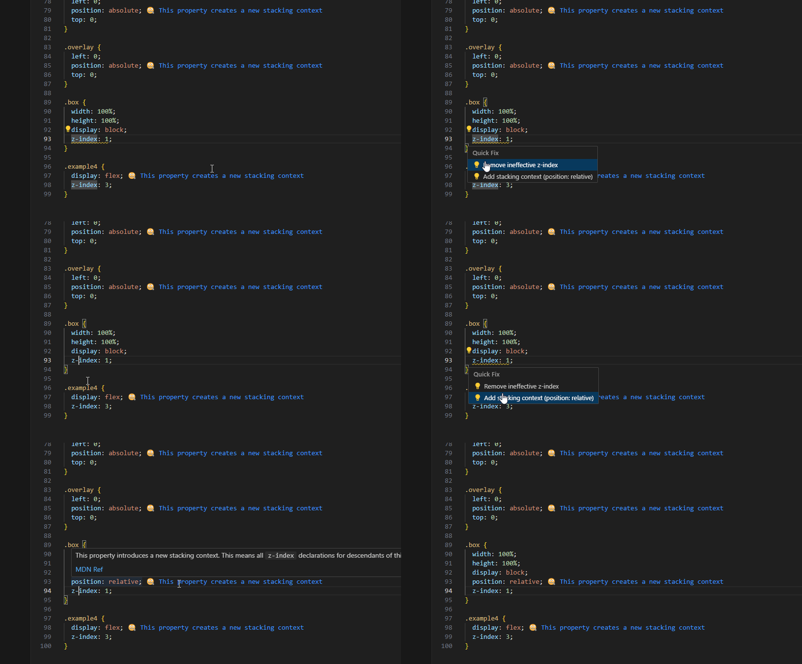
- Mike Rheault reached out to share a VSCode extension they created(opens in new tab) which highlights potential stacking context issues:

This extension works on .css and .scss files, but not CSS-in-JS.
- Giuseppe Gurgone reached out to let me know about this Chrome extension(opens in new tab) which adds a new “z-index” pane to the devtools.
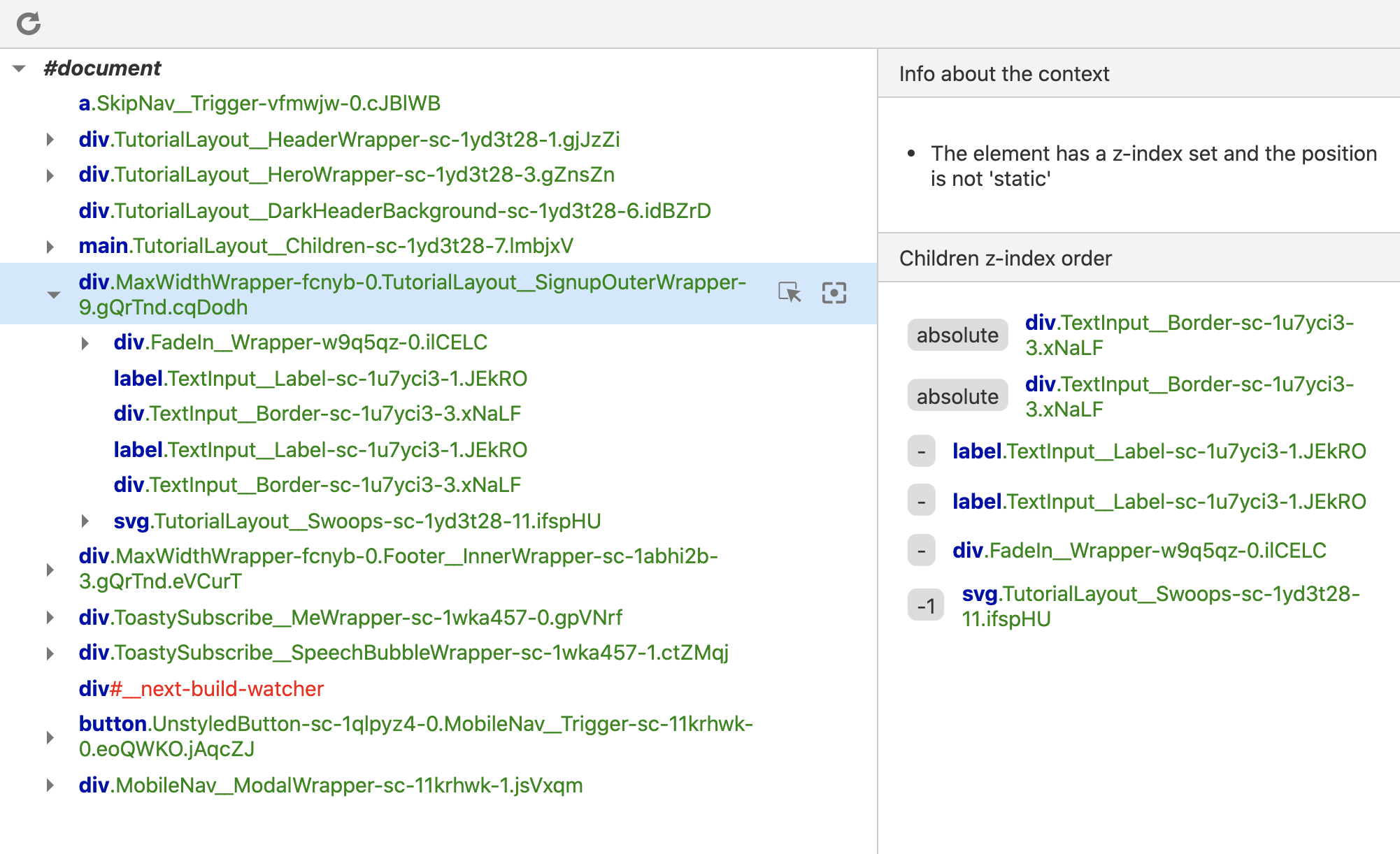
- Andrea Dragotta created an incredible browser extension that adds a bunch of super-important information about z-index and stacking contexts. It’s available for Chrome(opens in new tab) and Firefox(opens in new tab):

Between all of these tools, you should be able to find something which can help you diagnose and fix z-index bugs. I've been using Andrea’s Chrome extension, and it's fantastic!
Link to this headingGoing deeper
Stacking contexts are a good example of how CSS is built on "hidden mechanisms". You can spend years building interfaces with CSS without knowing that they exist.
Unless you explicitly take the time to learn about these mechanisms, your mental model will always be missing pieces. And if your mental model is even slightly misaligned, it's only a matter of time until that discrepancy causes problems.
CSS doesn't have warnings or error messages. When something surprising happens, there's no clear "next step" to figure out what went wrong. These disruptions take us out of flow state and shake our confidence. I think this is why so many front-end developers don't enjoy writing CSS.
Once you build up an intuition for the language, though, CSS becomes an absolute joy. I love writing CSS nowadays.
I want to help other developers discover this joy. I've created a comprehensive self-paced online course that explains how CSS works at a deeper level, and teaches the practical skills I use every day to build all kinds of user interfaces.
It's called “CSS for JavaScript Developers”(opens in new tab), and it's available now. 😄
Last updated on
September 13th, 2024