Particle effects ✨
- From
- Josh W. Comeau
- Reply-To
- me@joshwcomeau.com
- Sent
- May 13, 2024
This issue of my newsletter was sent to newsletter subscribers.
Sign up to receive future issues!
Hey folks!
You’re receiving this email because you signed up for updates about my upcoming Whimsical Animations(opens in new tab) course. I wanted to share some of what I’ve been up to!
In this course, we’ll cover a bunch of different things, from 2D canvas to SVG to scroll-driven animations. But the very first module is all about creating particle effects using plain ol’ DOM nodes.
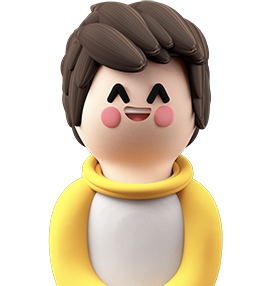
The main animation you’ll learn to build in the first module is this over-the-top “Like” button:
The course’s structure is that each module has one “core thing” that we build from the ground up. As you progress through the module, however, you’ll pick up a ton of broadly useful techniques, and you’ll practice using those techniques in a variety of scenarios.
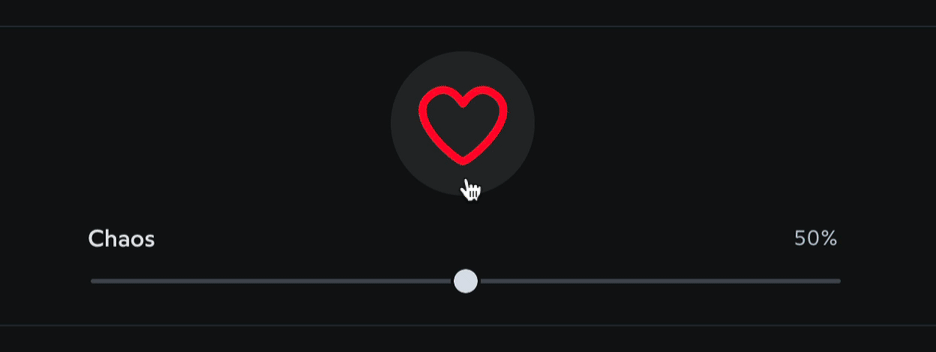
For example, you’ll use the same techniques to build this effect:
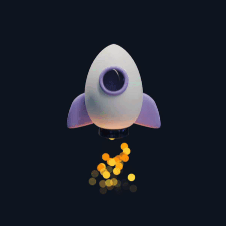
As well as this one:
My goal with this course is to give you the tools to build all sorts of cool stuff, including stuff I never imagined! I’m so much more interested in that, rather than giving you code snippets you can copy/paste for a handful of pre-baked animations.
Link to this headingDynamic keyframes
One of the core techniques you’ll learn in this module is the concept of “dynamic” keyframe animations.
Let’s suppose we’re building an animation like this:
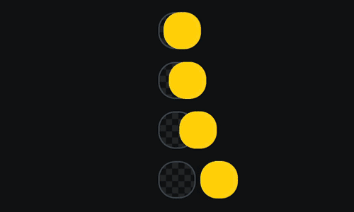
For endlessly-repeating animations like this, CSS keyframes are the main way to implement this sort of thing. But hm, how exactly do we use them here?
If we only had one oscillating ball, it’d be easy. We could specify the amount of oscillation like this:
@keyframes oscillate {
  from {
    transform: translateX(-16px);
  }
  to {
    transform: translateX(16px);
  }
}

.ball {
  animation:
    oscillate 1000ms ease-in-out infinite alternate;
}
(I’m assuming a lot of prior experience here with CSS keyframe animations; rest assured that my course will have a whole reference module that covers the fundamentals for stuff like this, so no worries if you haven’t used keyframe animations much. ❤️)
In the demo I showed above, though, we have four different oscillating balls, and they all oscillate by a different amount.
In the past, I’ve solved this by either creating four separate keyframe animations (which feels gross and doesn’t scale if we have hundreds of variants) or I’ve done it in JavaScript with setInterval (which also feels gross and has performance implications).
The mindblowing realization I had, a few years back, is that CSS variables can be accessed inside keyframe definitions.
Check this out:
<style>
  @keyframes oscillate {
    from {
      transform: translateX(calc(var(--amount) * -1));
    }
    to {
      transform: translateX(var(--amount));
    }
  }

  .ball {
    animation:
      oscillate 1000ms ease-in-out infinite alternate;
  }
</style>

<div class="ball" style="--amount: 8px;"></div>
<div class="ball" style="--amount: 16px;"></div>
<div class="ball" style="--amount: 32px;"></div>
Instead of specifying a hardcoded value like 16px, our keyframe animation pulls the value from a variable, --amount. Each .ball instance sets this variable to a different value.
In this setup, I’m setting that variable with inline styles in the HTML, but this same technique will work no matter how the variable is set (whether through a custom class, through JS, or even inherited from a parent element).
This helps us in our particle animation because we can use a single disperse keyframe for hundreds of different particles, each with its own custom destination:
@keyframes disperse {
  from {
    transform: translate(0px, 0px);
  }
  to {
    transform: translate(var(--x), var(--y));
  }
}
Pretty cool, right?
This is just one example of a core technique I find myself using over and over again, to create my animations and interactions. I share so many other tactics like this in the course, and we explore some of the cool things you can do with them.
I’m so excited to share this with y’all. I really think this’ll be a goldmine for folks who are interested in building cool animations. It’s still early days; my hope is to launch in “Early Access” by September.
That’s all for me for today!
This issue of my newsletter was sent to newsletter subscribers.
Sign up to receive future issues!
Interactive Courses
© 2018-present Joshua Comeau. All Rights Reserved.