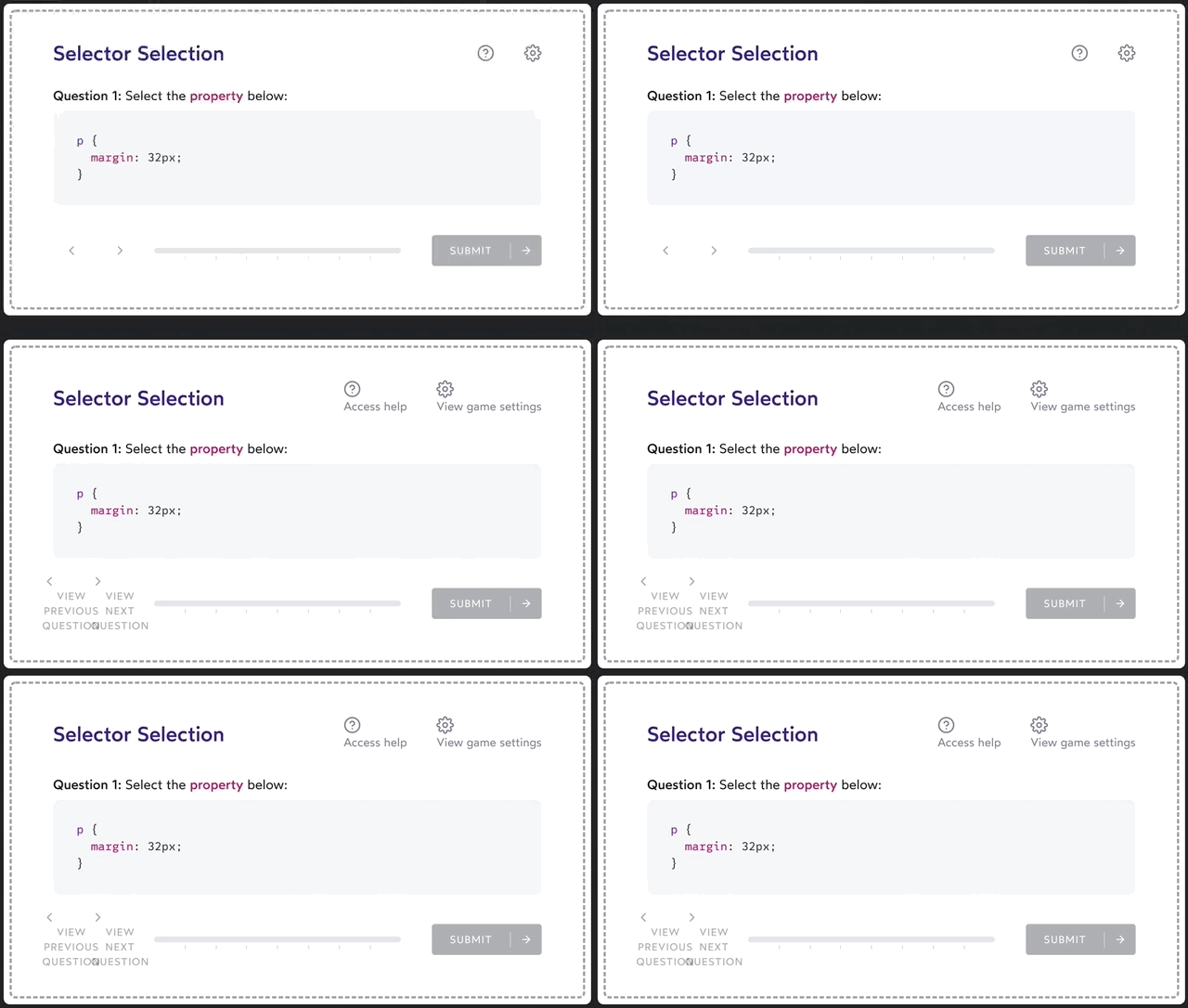
As a sighted user, it's probably clear what these icons would do, if you clicked on them:
For folks using screen readers, though, buttons without text can be absolutely mysterious. They might be announced simply as "button".
The good news is: we can solve this problem without compromising on our design! A VisuallyHidden component will allow us to place text inside this button that will only be made available to people using screen readers.
Here’s the CSS:
.visually-hidden:not(:focus):not(:active) {
  position: absolute;
  width: 1px;
  height: 1px;
  overflow: hidden;
  clip: rect(0 0 0 0); /* Legacy property for Internet Explorer */
  clip-path: inset(50%);
  white-space: nowrap;
}
And here’s a souped-up React component with some extra functionality:
// /src/components/VisuallyHidden.js

import React from 'react';

const VisuallyHidden = ({ children, ...delegated }) => {
  const [forceShow, setForceShow] = React.useState(false);

  React.useEffect(() => {
    if (process.env.NODE_ENV !== 'production') {
      const handleKeyDown = (ev) => {
        if (ev.key === 'Alt') {
          setForceShow(true);
        }
      };

      const handleKeyUp = (ev) => {
        if (ev.key === 'Alt') {
          setForceShow(false);
        }
      };

      window.addEventListener('keydown', handleKeyDown);
      window.addEventListener('keyup', handleKeyUp);

      return () => {
        window.removeEventListener('keydown', handleKeyDown);
        window.removeEventListener('keyup', handleKeyUp);
      };
    }
  }, []);

  if (forceShow) {
    return children;
  }

  return (
    <span className="visually-hidden" {...delegated}>
      {children}
    </span>
  );
};

export default VisuallyHidden;
It's used like this:
<Button>
  <Icon icon={gearIcon} size={32} />
  <VisuallyHidden>Access settings</VisuallyHidden>
</Button>
Link to this headingExplanation
This snippet might seem overly complex, but bear with me! It has a neat trick up its sleeve.
If you hold down the Alt key, the typically-hidden text springs into life, letting you verify that you haven't missed anything:

This functionality only exists in your development environment. It's stripped out of production builds automatically, so you don't have to worry about users stumbling upon this hidden debug feature.
I personally tap this character right before committing, but you can find whatever workflow works best for you.
Let's talk about some of this code.
Link to this headingThe CSS
This component uses the following CSS to effectively hide elements from sighted users:
.visually-hidden:not(:focus):not(:active) {
  position: absolute;
  width: 1px;
  height: 1px;
  overflow: hidden;
  clip: rect(0 0 0 0); /* Legacy property for Internet Explorer */
  clip-path: inset(50%);
  white-space: nowrap;
}
Why not just use display: none or visibility: hidden? In fact, these properties are too effective; they hide the contents from screen-reader users as well!
This snippet is battle-tested. It works across all major browsers, and has zero impact on layout.
It's presented as plain CSS here for maximum compatibility, but feel free to use styled-components, CSS modules, or whatever you use for styling!
Link to this headingThe hiding behaviour
Most of the code in our React component exists to allow the text to be toggled on and off with a keyboard shortcut.
Critically, the bulk of the logic is wrapped in the following conditional:
if (process.env.NODE_ENV !== 'production') {
  // Most of the logic
}
When we build for production, Webpack (or whichever bundler you use) will replace process.env.NODE_ENV with the string "production". That means that this code will actually look like this:
if ('production' !== 'production') {
  // Most of the logic
}
Modern JS bundlers use a strategy called Dead Code Elimination(opens in new tab). This means that if the compiler can tell that some code will never be run, it will be stripped from the build. Since it is impossible for "production" to ever not equal "production", all of this code will be stripped out. This little boon to developer experience doesn't come at the cost of user experience, since it doesn't actually add any weight to the build ⚡️
The logic itself is pretty typical React code:
- Initialize a state variable,
forceShow, tofalse - Upon mount, register key-down and key-up handlers
- When the user presses a key, check and see if it's equal to the "Alt" key. If so, flip the state variable to
true - When the user releases a key, check if it's "Alt". If so, flip the state back to
false - If the state variable is
true, render the children without any CSS applied (so it'll be visible) - Otherwise, wrap the children in our CSS snippet, to hide it from sighted users.
Link to this headingThe wrapper
This component does produce a bit of extra HTML. It needs to, since we need an element to apply our CSS to!
In this case, it's a span:
const VisuallyHidden = ({ children, ...delegated }) => {
  // ✂️ Stuff omitted

  return (
    <span style={hiddenStyles} {...delegated}>
      {children}
    </span>
  );
}
A span is used instead of a div because many elements (including buttons) consider it invalid to nest block-level elements inside of them.
delegated is my name for any additional props that should be passed along to this wrapping element. For example, you may wish to pass a data-attribute for your end-to-end tests:
<VisuallyHidden
  data-test-id="help-action-alt-text"
>
  View help screen
</VisuallyHidden>
Link to this headingIn conclusion
It's important to never forget that not all of our users use our products the same way we do. Components like this don't take long to implement, and they make a huge difference to our users.
This snippet, along with any other code on this page, is released to the public domain under the Creative Commons Zero (CC0) license(opens in new tab).
Last updated on
June 11th, 2024