Long-time readers of this site have probably picked up that I am a big fan of animations. When used properly, I believe they add a ton of value to the user experience.
That said, it's important to be mindful of the fact that not everybody experiences them the way I do. For some folks, motion can trigger physical symptoms like nausea, dizziness, and malaise. I very much don't want to cause any of those symptoms!
Operating systems offer a remedy for this: users can opt out of animations. The setting is meant primarily for the OS, but websites and web applications can read that value. It doesn't disable animations automatically, so the onus is on us—the developers—to take advantage of it.
In this tutorial, we'll see how to use the prefers-reduced-motion media query to disable animations in React.
Link to this headingWhy is this necessary?
The human body is comprised of many different systems responsible for regulating and managing this whole being-alive thing. One of those systems is called the vestibular system. It includes the inner ear and parts of the brain, and it manages our sense of balance.
You know when you spin really fast and it makes you dizzy? By spinning, you're sloshing fluid around in your inner ear, and the brain uses that fluid to help it figure out which direction is “up”. This is similar to how a level works:

When you spin around in circles, your brain receives incompatible information from different sources: your ear-fluid is claiming one thing, while your eyes are claiming another. This dissonance is super disorienting and unpleasant.
For most people, unless you're intentionally trying to confuse this system, it works properly, and you can move through your life trusting that it will keep you upright. But for others, this system is not always trustworthy—a vestibular disorder causes the vestibular system to feed the brain bad information.
The most commonly-known symptom of this is vertigo; all of a sudden, someone will feel like gravity is pulling them in the wrong direction. This is just one way that vestibular disorders can manifest.
Troublingly, animations can be a trigger for some folks, leading to a whole range of unpleasant side-effects: dizziness, nausea, headaches, malaise. It can feel as if our website is reaching out and spinning the person in their office chair 😬
It is estimated that up to 35% of adults 40+ in the US have experienced some form of vestibular dysfunction, with 5% reporting chronic problems ( source(opens in new tab)).
We shouldn't forget about these people when developing animations.
Link to this headingOpting out of animations
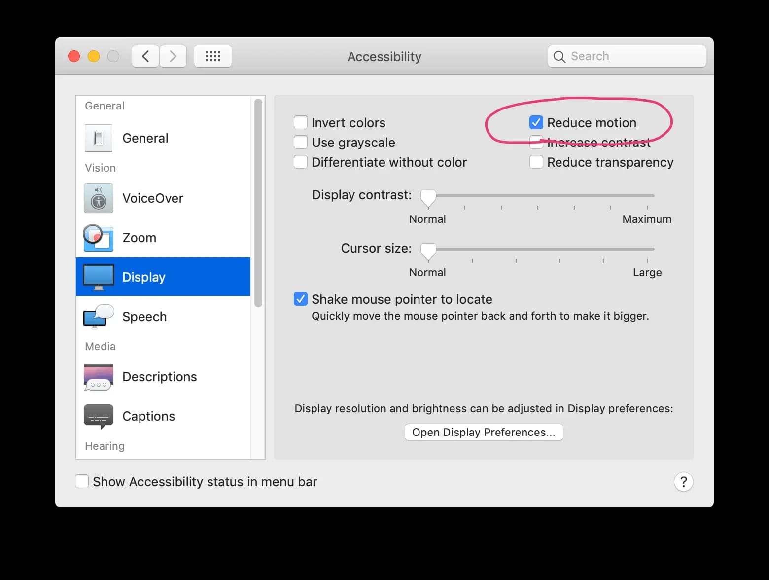
For a few years now, operating systems have been letting users opt out of motion, typically within the Accessibility settings:

Happily, this setting now exists in all mainstream operating systems, including desktop (MacOS 10.12+, Windows 7+, Linux) and mobile (iOS, Android 9+).
When this box is ticked, the operating system disables all animations (eg. the famous genie animation when minimizing windows on MacOS), but Apple decided to start exposing that setting to browsers using a media query, prefers-reduced-motion. This way, websites can read that same value, and use it to disable animations.
In addition to OS-level support, we also need to think about browser support. Fortunately, browser support is quite good:
For folks using browsers or operating systems that don't support the feature, we'll default to no animations. This way, we're covered from an accessibility perspective regardless of the user's device and software.
Link to this headingUsing the media query
Animations can be disabled in CSS using a media query:
.fancy-box {
  width: 100px;
  height: 100px;
  transform: scale(1);
  transition: transform 300ms;
}

.fancy-box:hover {
  transform: scale(1.2);
}

@media (prefers-reduced-motion: reduce) {
  .fancy-box {
    transition: none;
  }
}
In this case, we're starting from a place of animations being enabled, and explicitly disabling them based on a media query. A better mental model is to think in terms of the reverse: start without animations, and enable them if the user wishes:
.fancy-box {
  width: 100px;
  height: 100px;
  transform: scale(1);
  /* No more `transition` here! */
}

.fancy-box:hover {
  transform: scale(1.2);
}

@media (prefers-reduced-motion: no-preference) {
  .fancy-box {
    transition: transform 300ms;
  }
}
To be clear, no-preference is the default value. Users who have never fiddled with their accessibility settings will still see our animations; there is no explicit "opt-in" required from a user's perspective.
By switching it up so that the transition is set from within a media query, we ensure that the animation is disabled by default for users on browsers/devices that don't support this property. Browsers ignore CSS inside unrecognized media queries, so it's as if this transition doesn't exist for them.
Link to this headingIn JS-land
The media query shown above works great for animations that take place entirely from within CSS (eg. transitions, keyframe animations). However, there are many types of animations that cannot be done entirely through CSS:
- Animations using spring physics.
- Animations involving the cursor coordinates, scroll position, or other “environment” factors.
- HTML5 Canvas animations.
- Certain kinds of SVG animations.
Most of the animations on this site take place in JS, because they fit into one (or more) of these categories.
Because this feature is implemented as a media query, it can be accessed the same way we access any media query values in JS: using window.matchMedia.
function getPrefersReducedMotion() {
  const QUERY = '(prefers-reduced-motion: no-preference)';
  const mediaQueryList = window.matchMedia(QUERY);

  const prefersReducedMotion = !mediaQueryList.matches;

  return prefersReducedMotion;
}
mediaQueryList.matches will be true if the user doesn't have a preference—in other words, they haven't ticked the "reduce motion" checkbox. Remember, we're checking for "no-preference". If they have ticked the box, "no-preference" will be false. So to figure out if the user prefers reduced motion, we flip this boolean with !mediaQueryList.matches.
(I recognize that this is a lot of double-negatives—sorry about that! We need to do it in this roundabout way to ensure animations are disabled for folks using unsupported browsers/devices.)
We can also use event listeners to update this value when it changes:
const QUERY = '(prefers-reduced-motion: no-preference)';

const mediaQueryList = window.matchMedia(QUERY);

const listener = (event) => {
  const getPrefersReducedMotion = getPrefersReducedMotion();
};

mediaQueryList.addEventListener('change', listener);

// Later:
mediaQueryList.removeEventListener('change', listener);
This listener will fire when the user toggles the "Reduce motion" checkbox in their operating system.
We want to listen for this event, because we want to immediately terminate animations if the user toggles the box, even if the page has already loaded / the animation is in progress.
Link to this headingThe hook
We can tie this into our React lifecycle with a hook!
const QUERY = '(prefers-reduced-motion: no-preference)';

const getInitialState = () => !window.matchMedia(QUERY).matches;

function usePrefersReducedMotion() {
  const [prefersReducedMotion, setPrefersReducedMotion] =
    React.useState(getInitialState);

  React.useEffect(() => {
    const mediaQueryList = window.matchMedia(QUERY);

    const listener = (event) => {
      setPrefersReducedMotion(!event.matches);
    };

    mediaQueryList.addEventListener('change', listener);

    return () => {
      mediaQueryList.removeEventListener('change', listener);
    };
  }, []);

  return prefersReducedMotion;
}
This is a lot of code, so let's break it down:
- We initialize some React state by checking the initial value of the media query
- On mount, we set up an event listener so that we update the state whenever the media query changes
- On unmount, we remove the event listener, to avoid a memory leak if a component unmounts/remounts a lot.
- We only want to run this effect when the component mounts, so we pass an empty dependency array.
- We return a boolean value that represents whether the user has disabled animations or not.
Link to this headingSSR Safety
If you try and use this hook as-is in a Gatsby or Next.js app, you'll get an error: 'window' is not defined.
Gatsby and Next take advantage of server-side rendering, which means that the HTML is pre-rendered at some point before it's sent to the browser. When we first render our React component tree, we don't know whether the user prefers reduced motion or not!
As it turns out, this is kind of a tricky problem; I go into depth in my blog post The Perils of Rehydration. The TL:DR; is that our first render on the client needs to match the original render on the server.
Here's an updated hook to be SSR-safe:
const QUERY = '(prefers-reduced-motion: no-preference)';

function usePrefersReducedMotion() {
  // Default to no-animations, since we don't know what the
  // user's preference is on the server.
  const [prefersReducedMotion, setPrefersReducedMotion] =
    React.useState(true);

  React.useEffect(() => {
    const mediaQueryList = window.matchMedia(QUERY);

    // Set the true initial value, now that we're on the client:
    setPrefersReducedMotion(
      !window.matchMedia(QUERY).matches
    )

    // Register our event listener
    const listener = (event) => {
      setPrefersReducedMotion(!event.matches);
    };

    mediaQueryList.addEventListener('change', listener);

    return () => {
      mediaQueryList.removeEventListener('change', listener);
    };
  }, []);

  return prefersReducedMotion;
}
In order to be SSR-safe, we have to make a compromise: we'll disable animations for all users in the very first render. If you have some animations that run immediately on mount, they might become disabled for everybody by this hook. For that reason, I recommend only using this variant of the hook if you use Gatsby/Next or any other SSR implementation.
For more information, be sure to check out “The Perils of Rehydration”.
Link to this headingIn Action
Here's how we'd use this hook with React Spring, a spring-physics-based animation library:
import { useSpring, animated } from 'react-spring';

function Box({ isBig }) {
  const prefersReducedMotion = usePrefersReducedMotion();

  const styles = useSpring({
    width: 100,
    height: 100,
    background: 'rebeccapurple',
    transform: isBig ? 'scale(2)' : 'scale(1)',
    immediate: prefersReducedMotion,
  });

  return (
    <animated.div style={styles}>
      Box!
    </animated.div>
  );
};
React Spring lets us disable motion by setting immediate to true, so we can pass our prefersReducedMotion boolean straight to it!
The great thing about this hook abstraction is that it's plug-and-play; you can drop it into any component and wire it up in 2 lines of code. Best of all, it's reactive—it adapts immediately to a change in preferences:
Link to this headingWithout the hook
This custom hook is great for animations driven by JS, such as those using React Spring. For pure CSS animations, you can use the media query!
For example, here's an animation using our new hook, and inline styles, with styled-components:
function Box({ isBig }) {
  const prefersReducedMotion = usePrefersReducedMotion();

  const styles = {
    transform: isBig ? 'scale(2)' : 'scale(1)',
    transition: prefersReducedMotion ? undefined : 'transform 300ms',
  };

  return <Wrapper style={styles}>Box!</Wrapper>;
};

const Wrapper = styled.div`
  width: 100px;
  height: 100px;
  background: rebeccapurple;
`;
You could use the hook in this case, but because we're talking about a CSS transition, it's better to use the “vanilla” media query:
function Box({ isBig }) {
  const styles = {
    transform: isBig ? 'scale(2)' : 'scale(1)',
  };

  return <Wrapper style={styles}>Box!</Wrapper>;
};

const Wrapper = styled.div`
  width: 100px;
  height: 100px;
  background: rebeccapurple;

  @media (prefers-reduced-motion: no-preference) {
    transition: transform 300ms;
  }
`;
The usePrefersReducedMotion hook is a hammer, but not every animation is a nail. Both solutions will work great, but the latter CSS-only approach is more straightforward and easier to follow.
Link to this headingEmulating reduced motion
It’s important to actually test our applications with the “Reduce Motion” option enabled, to see what the user experience is like.
You can do this by going into your operating system preferences and toggling the setting, but fortunately, browsers make it even easier for us.
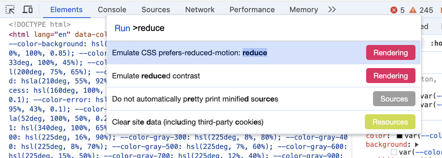
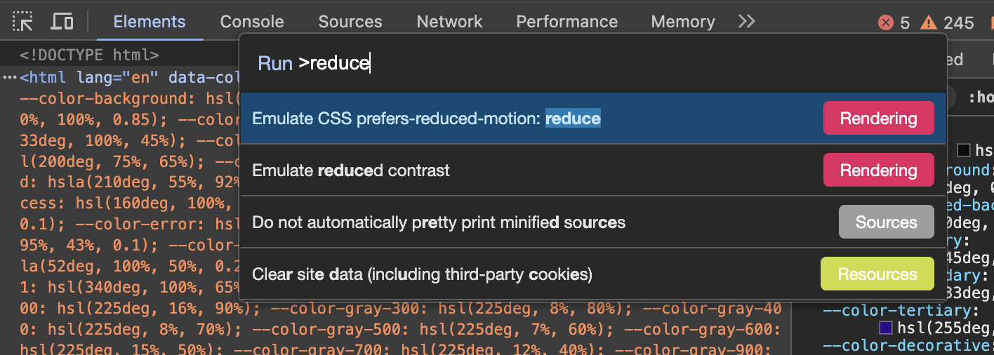
In Chrome, for example, we can enable prefers-reduced-motion: reduce by opening the Command Palette (Ctrl + Shift + P), typing “reduce”, and selecting the first option:


Once selected, this browser tab will act as though the “Reduce Motion” option is enabled in your operating system. To restore the default behaviour, you can close and reopen the devtools (all emulation is reset the moment the devtools are closed).
Link to this headingConclusion
As humans, we tend to bias around our own experiences. The "Golden Rule"—treat others as you want to be treated—totally ignores the fact that people are different!
Not everyone experiences things the same way, and we need to be mindful about that. An animation that delights me might make someone else so woozy that they need to lie down for half an hour afterwards.
Every non-trivial feature that gets added to a browser is the result of a lot of hard work and coordination. The fact that the prefers-reduced-motion media query exists in every major browser is a testament to how much work browser vendors put in, not to mention the operating system developers who built the control in the first place!
They've given us the tools to solve this problem, and it's on us to carry the torch for the last mile. Let's not drop it!
Last updated on
March 5th, 2025